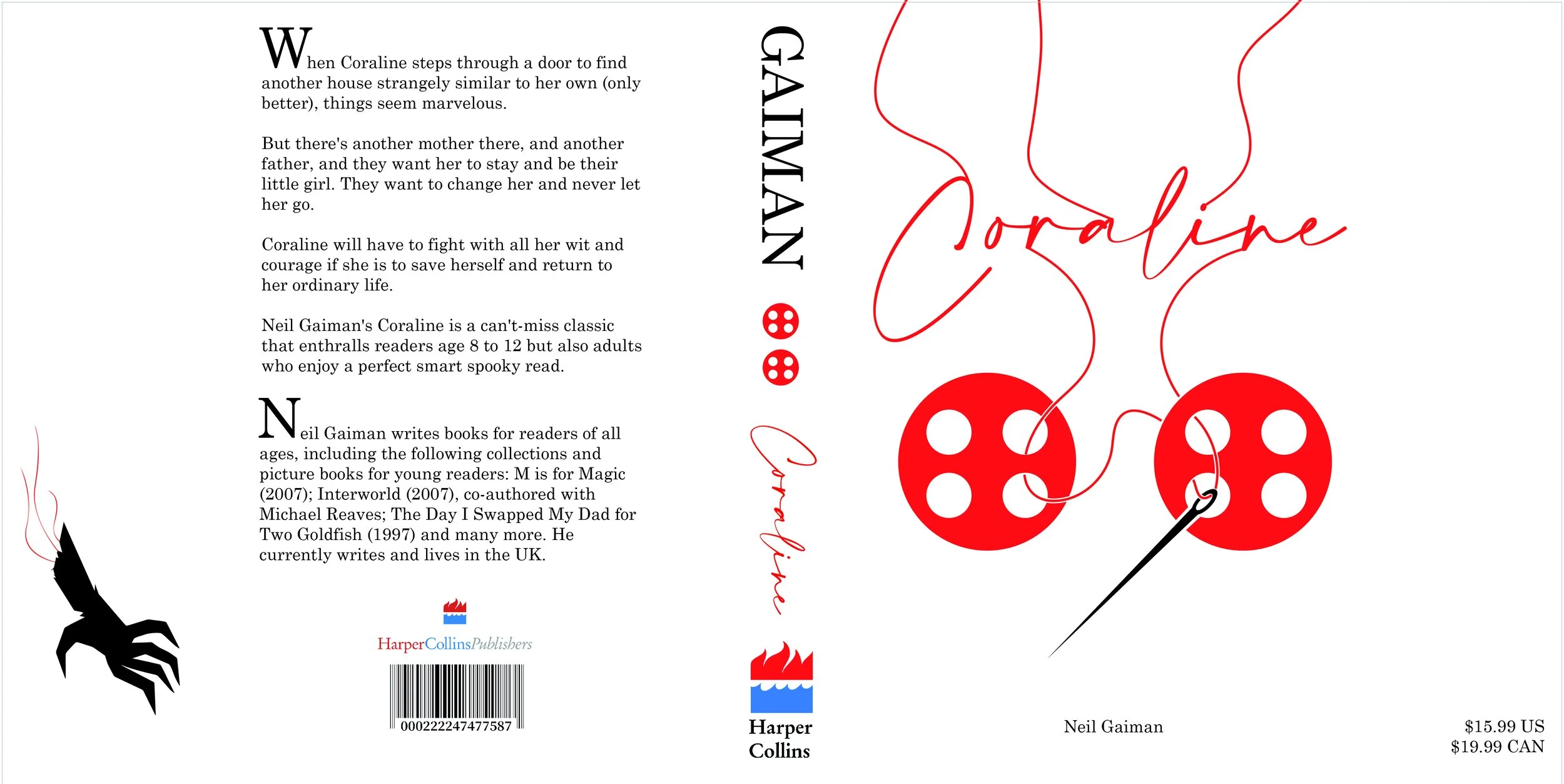
Book Sleeve Re-Design: Coraline
Coraline was one of my favorite books as a kid, and so it was fun to try and create a simplistic cover.
Full Sleeve Design
The Harper Collins brand info, as well as the barcode were sourced from:
https://brandfetch.com/harpercollinspublishings.com
https://stock.adobe.com/search?k=barcode
Typace and Specs:
Body: Century Schoolbook / Regular / 14pt
Title: Amalfi Coast / Regular / 68 pt
CMYK / 300DPI / 18.05x9.05in
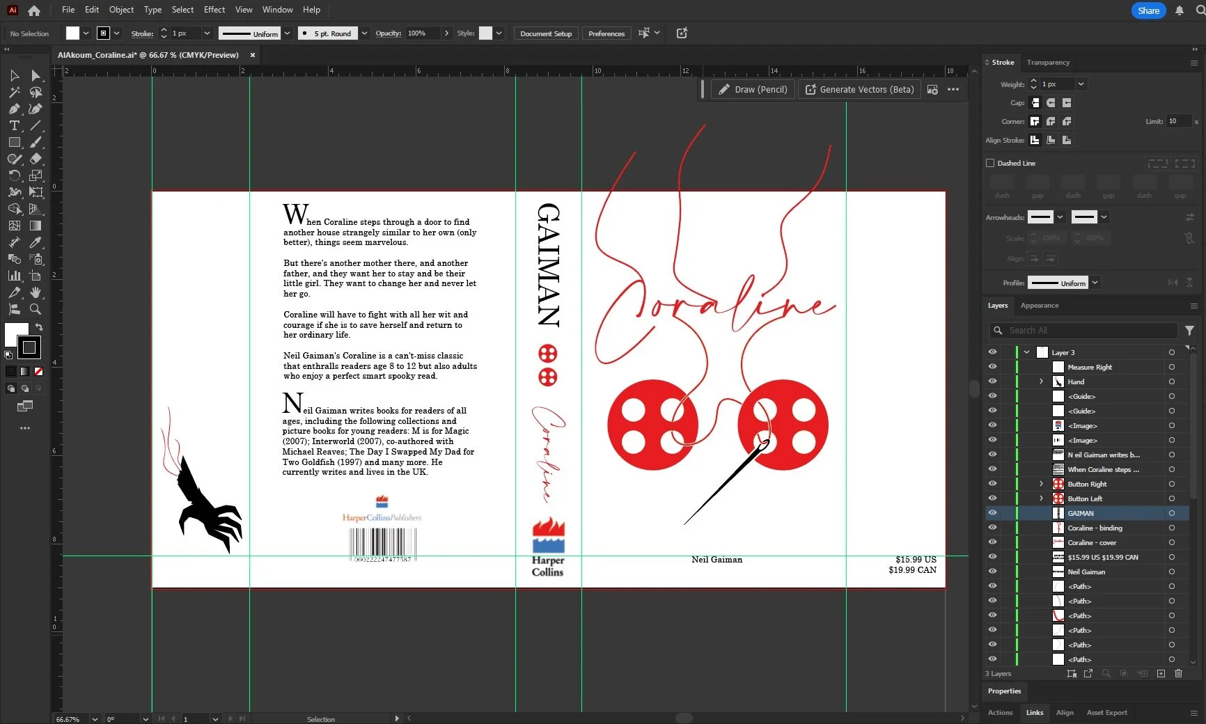
Workspace
A screen cap of my work window. Since it was a pretty simply set of illustrations, I grouped them all together. They were created by layering shapes.
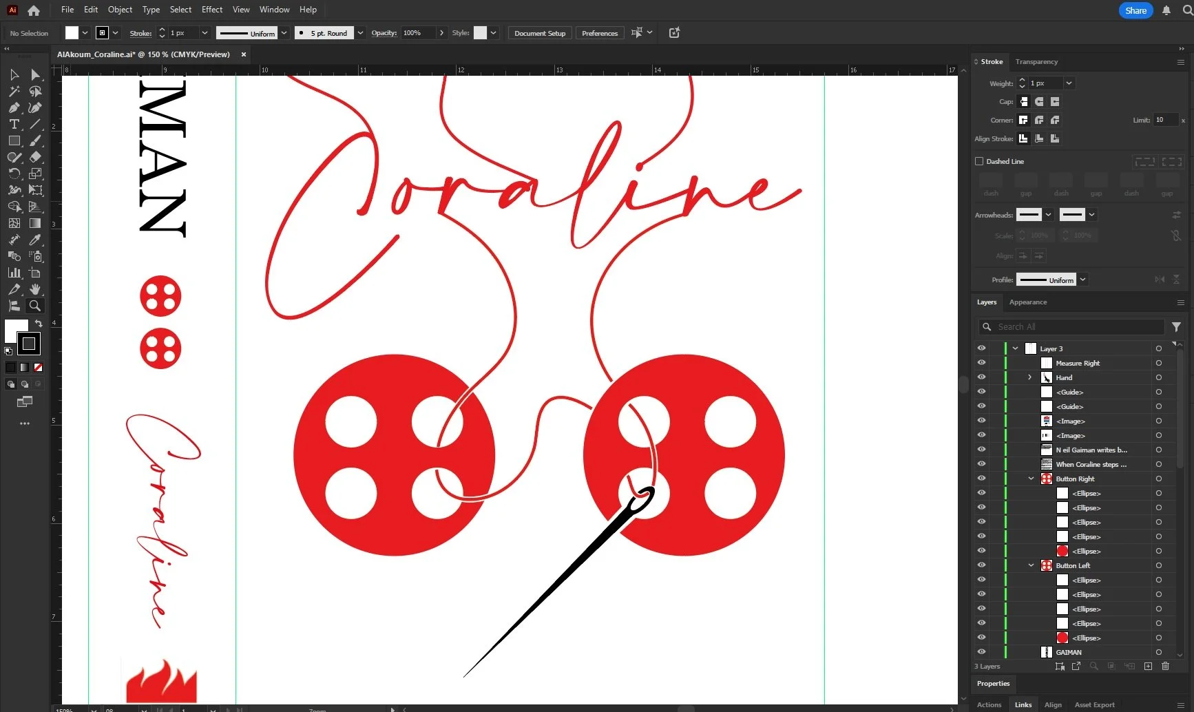
A closer look at the image and layers.

The Hand
The creepiest part of the book to me, so I really wanted to include it, the severed hand Coraline ends up trapping in a well! I layered a bunch of shapes and then added some red string to make sure it was cohesive with the cover.
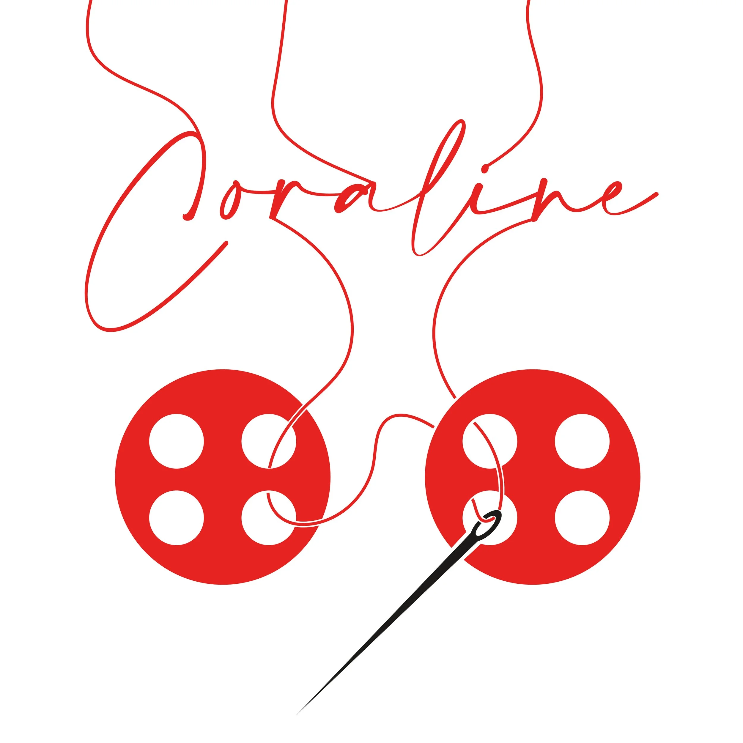
The Button eyes
I’m pretty sure everyone who’s read the book knows how scary this part was. When the other Mother tells her to sew the buttons onto her eyes. I wanted it to be creepy and also menacing, so I chose a straightforward pose and blood red color. The illustration was created similarly to the hand, with basic shapes layered over.